Framer Design Styles — How to Change Colors, Fonts & Layout
Design styles make it easy to update the look of your website from one place. In this tutorial, you’ll learn how to use text, link, and color styles, and how to adjust layout and sizing to customize your design efficiently in Framer.

10
min read


Design styles make it easy to update the look of your website from one place. In this tutorial, you’ll learn how to use text, link, and color styles, and how to adjust layout and sizing to customize your design efficiently in Framer.
Design styles
Design styles help you keep your website consistent, organized, and easy to update.
They allow you to reuse styles for text, colors, and links, and edit them in one place, while the changes apply everywhere they are used. This is especially useful for templates, where users want to quickly customize the design without touching every element manually.
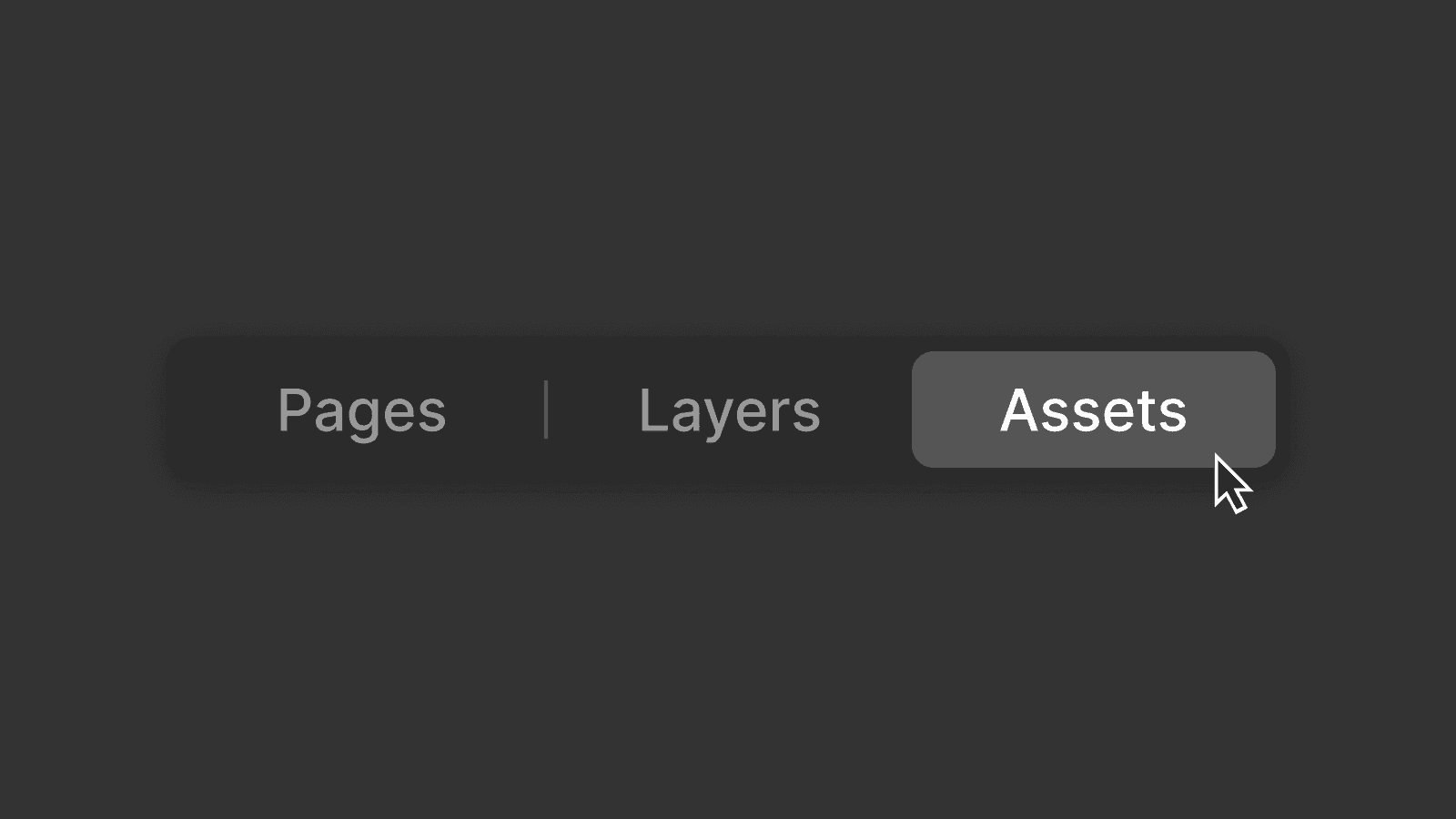
You can find design styles in the left panel in the assets tab under components.
Text styles
Text styles are used to define how different types of text look across your website.
In most templates, you'll find text styles for
Headings
Body text
Smaller supporting text
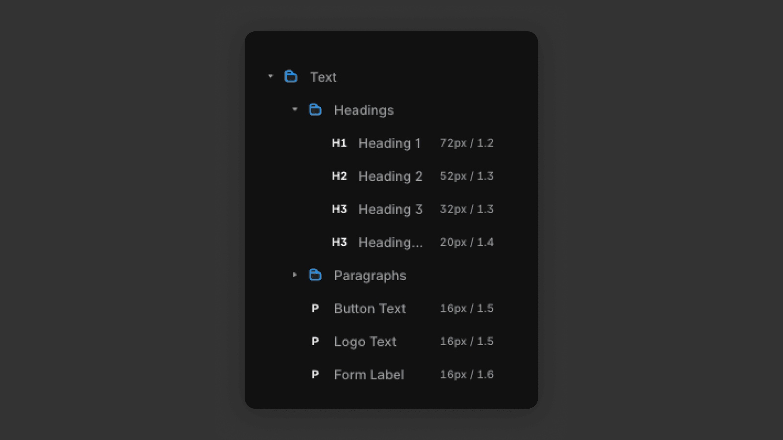
A good structure is
One H1 per page (main page title)
H2 for section headings
H3 for sub-sections
Paragraphs for body text
When you click on a text element, you can see which text style it is using in the right panel.
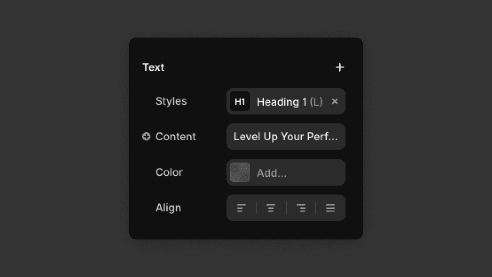
When you go to the assets tab in the left panel, select the text style the element is using and edit it there, it will automatically edit all the elements using the given text style across the website.
This makes global typography changes fast and safe.
Link styles
Link styles work the same way as text styles, but specifically for links.
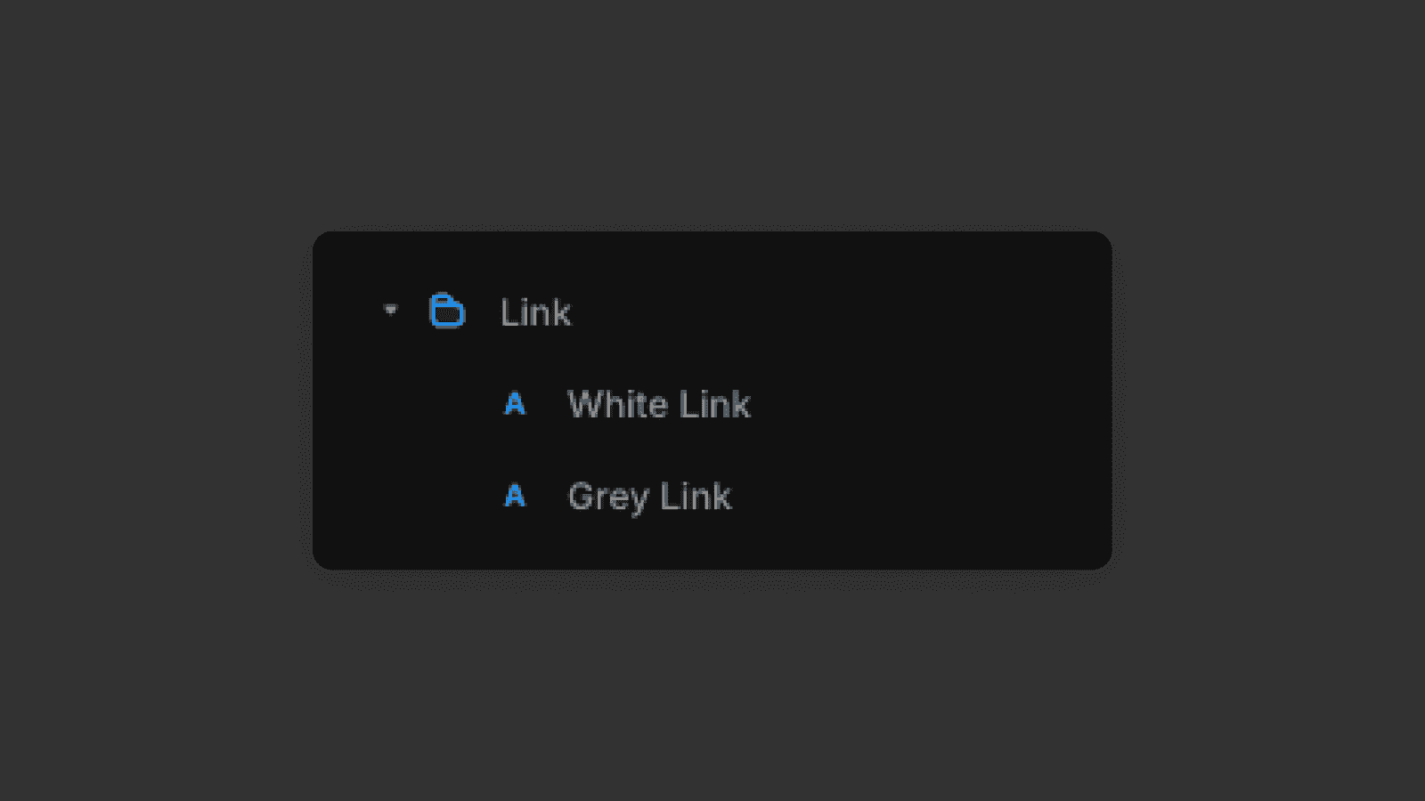
They define things like
Text color
Hover state
Active or visited state
You can see the link style in the right panel on the top when you click on a link element.
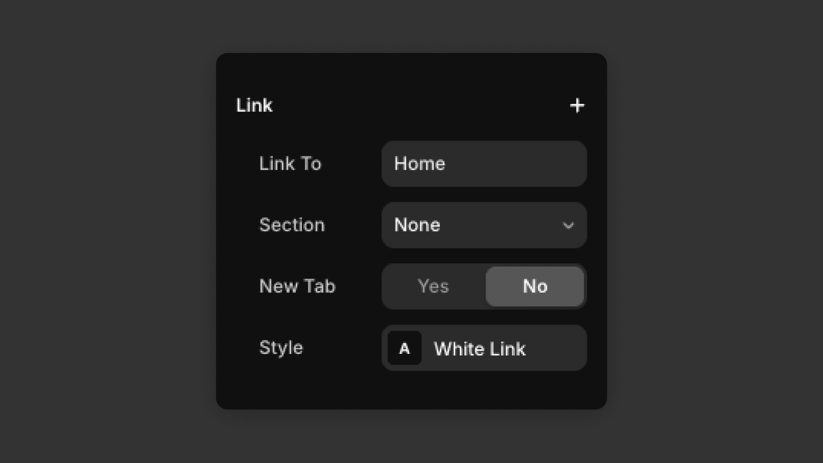
When you update a link style, all links using that style update automatically. This helps keep interactions consistent and avoids having different-looking links across the site.
Color Styles
Color styles let you define reusable colors for your design.
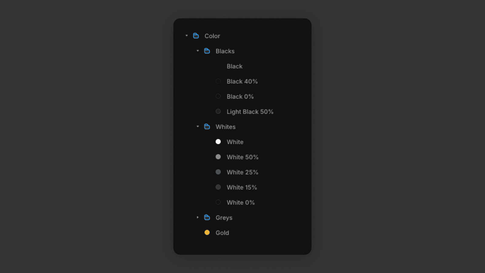
Instead of picking colors manually for each element, you assign a color style. These are commonly used for
Background colors
Text colors
Button fills
Borders and accents
When you update a color style, every element using it updates instantly. This is ideal for:
Changing brand colors
Creating light and dark variations
Letting users customize templates easily
Changing the design without styles
To change the design without styles, the right panel is your main tool for manual adjustments. You just have to click on an element and set the properties you want. Properties like text content, font size, colors are self explanatory, but let me explain how width height and their units work and how layouts work.
Width, height, and units
When adjusting layout and spacing, it's important to understand width, height, and units.
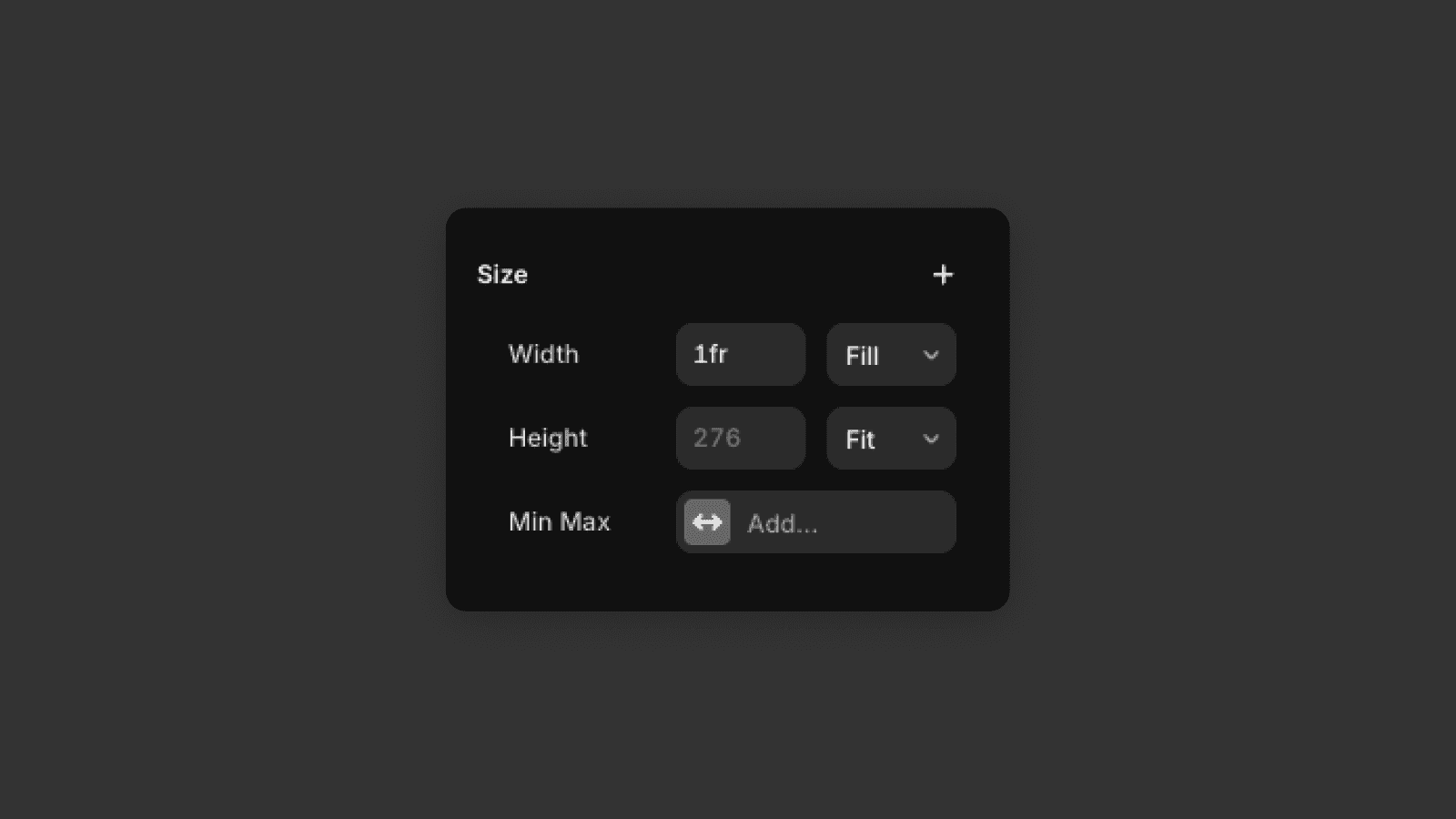
Fixed values (px) are useful for precise sizing
Relative units (%) help layouts adapt to different screen sizes
Fit-content lets elements size themselves based on content
Fill stretches the element to fill all available space defined by the parent element's dimensions.
Using flexible values where possible helps keep your layout responsive and easier to maintain.
Layout
Layout controls how elements are arranged inside a container. In Framer, this is most commonly done using Stacks.
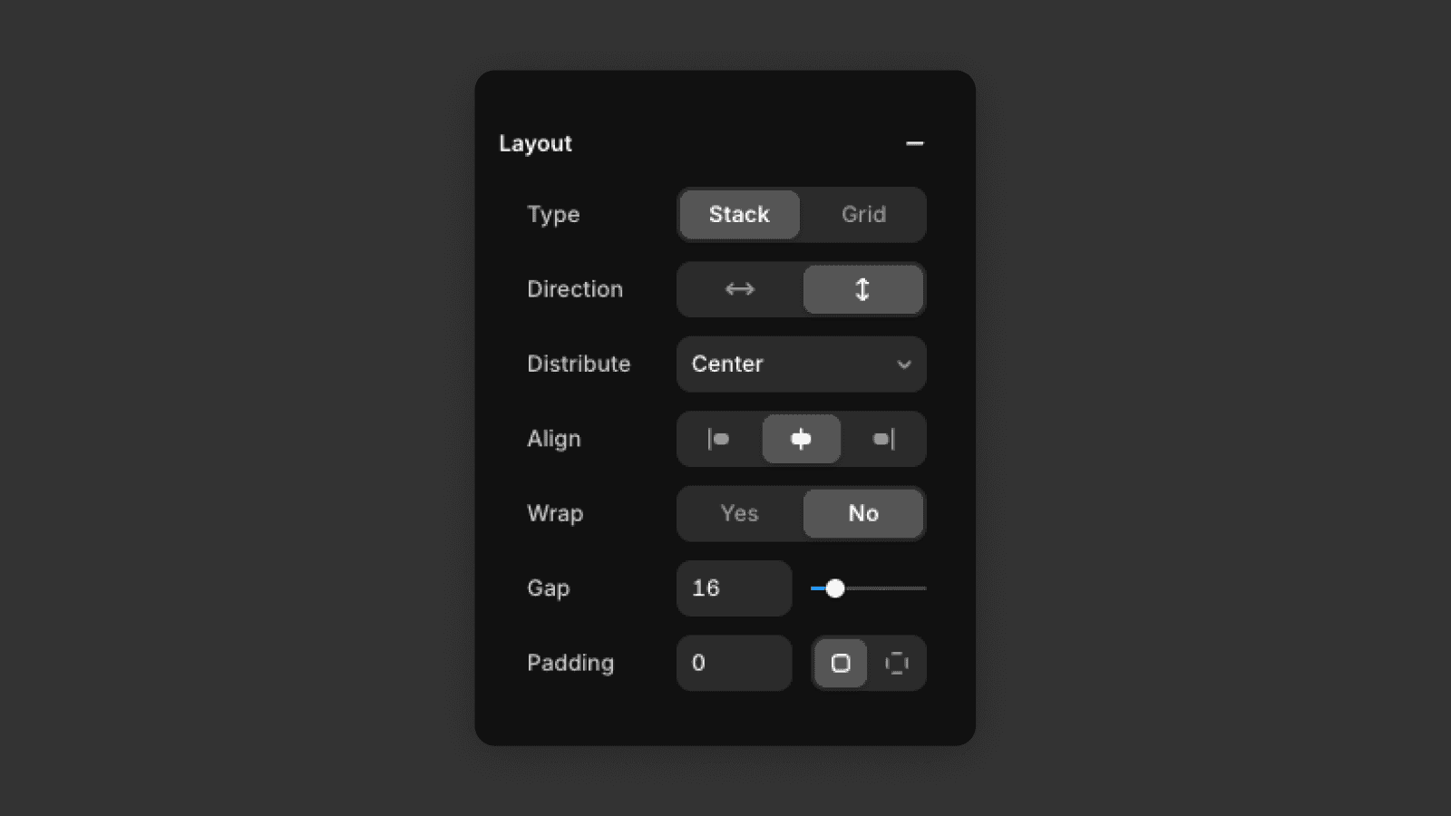
Direction defines how elements are stacked — vertical (top to bottom) or horizontal (left to right).
Distribution controls how elements are positioned along the main axis, such as start, center, or space between.
Gap sets the spacing between elements. Use this instead of adding margins to individual items.
Padding controls the space inside the container, between the content and its edges.
Using layout settings helps keep spacing consistent and layouts easy to adjust.
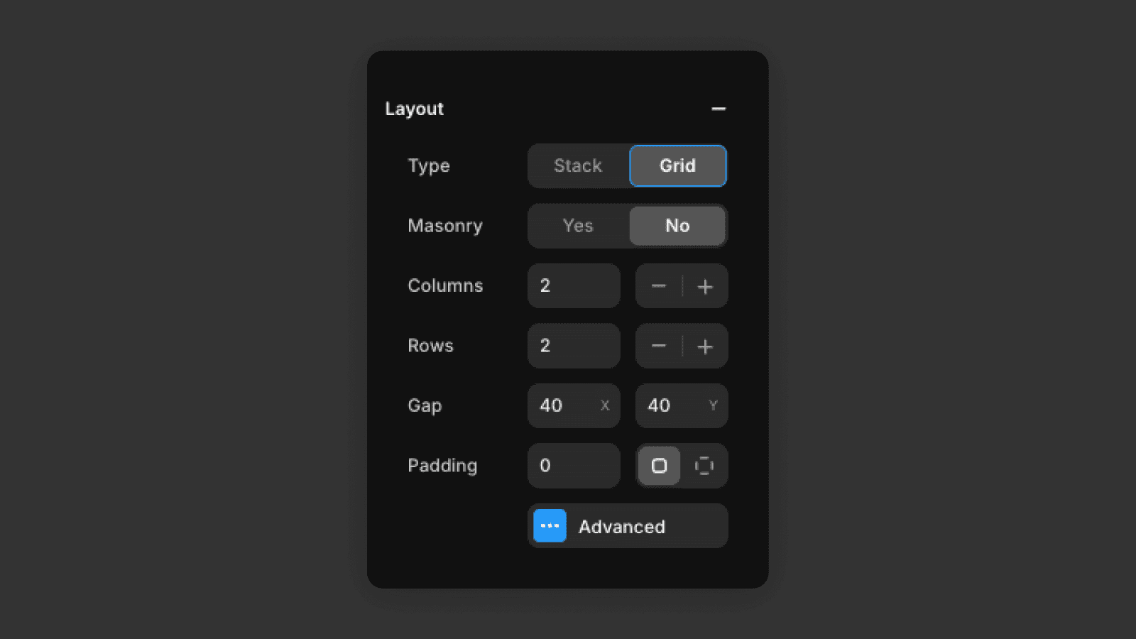
You can also use grid and there you define how many rows and columns you want in the grid and define the gaps.
You now know how to use design styles to control text, links, and colors from one place, and how to adjust sizing and layout using width, height, and layout settings. With these tools, you can quickly customize designs, keep everything consistent, and confidently update templates without breaking the layout.
Frequently asked questions
What are design styles in Framer?
Design styles in Framer are reusable definitions for typography, colors, and links. Assigning a style to elements lets you update the entire site's look from a single place in the Assets panel — no manual element-by-element editing needed. They work alongside layout templates to keep your site visually consistent across all pages.
How do I change the font or typography in a Framer template?
Open the Assets panel and find the text style used by the element (visible in the right panel when an element is selected). Edit the text style there — the change will apply to all elements using it across the site.
How do I change brand colors in a Framer template?
In the Assets panel, find the color style you want to update and change its value. Every element using that color style updates instantly — backgrounds, text, buttons, and borders — making rebranding fast and consistent.
What is the difference between px, %, Fill, and Fit Content in Framer?
px sets a fixed size. % makes the element size relative to its parent. Fill stretches the element to use all available space in its parent container. Fit Content sizes the element based on its own content — useful for buttons and labels.


