Personal Trainer Website Design: What to Include and How to Get It Right
A practical guide to personal trainer website design — what pages to build, what content converts, and how to turn visitors into paying clients.

8
min read


Your website is the first thing potential clients check before booking a session. This guide covers what to include in your personal trainer website design — from the homepage to transformation galleries — and how to launch without spending months on it.
Why personal trainers need a proper website
When someone sees your Instagram and actually considers hiring you, the first thing they do is Google you. If they don't find a website — or find something that looks unprofessional — you lose the client before you ever get a chance to talk to them.
A personal trainer website does something social media can't: it gives you a permanent, professional presence that you fully control. No algorithm changes, no account restrictions, no character limits. Just your offer, your results, and a clear way to get in touch.
It also helps you show up in local search. Someone searching "personal trainer in [city]" or "online personal trainer" is already looking to hire. A website with basic SEO gets you in front of those searches. A social profile doesn't. Setting up a Google Business Profile alongside your website amplifies this further — it puts you on Maps and in the local pack for searches near you.

What pages does a personal trainer website need?
You don't need a 10-page website. Most successful personal trainer sites work with 2–3 focused pages:
Homepage — This does the heavy lifting. It introduces who you are, who you help, what results you get, and how to get started. For most trainers, 90% of conversions happen here.
Transformations page — Before-and-after results are your strongest social proof. A dedicated page for client transformations lets you show the full picture: photos, timeframes, and short client stories. This page builds trust faster than any text.
Contact page (optional but useful) — If you use an inquiry form or want to collect information before a call, a separate contact page keeps things clean. You can also put a contact form directly on the homepage.
That's it. A focused, well-designed 2–3 page site outperforms a cluttered 8-page one every time.
What to put on your homepage
Your homepage has one job: convince someone who doesn't know you yet that you're the right person to help them. Here's what to include:
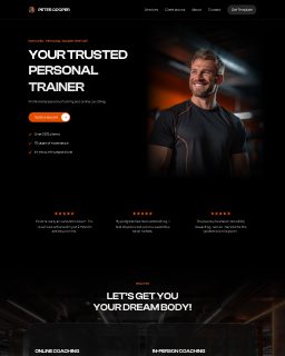
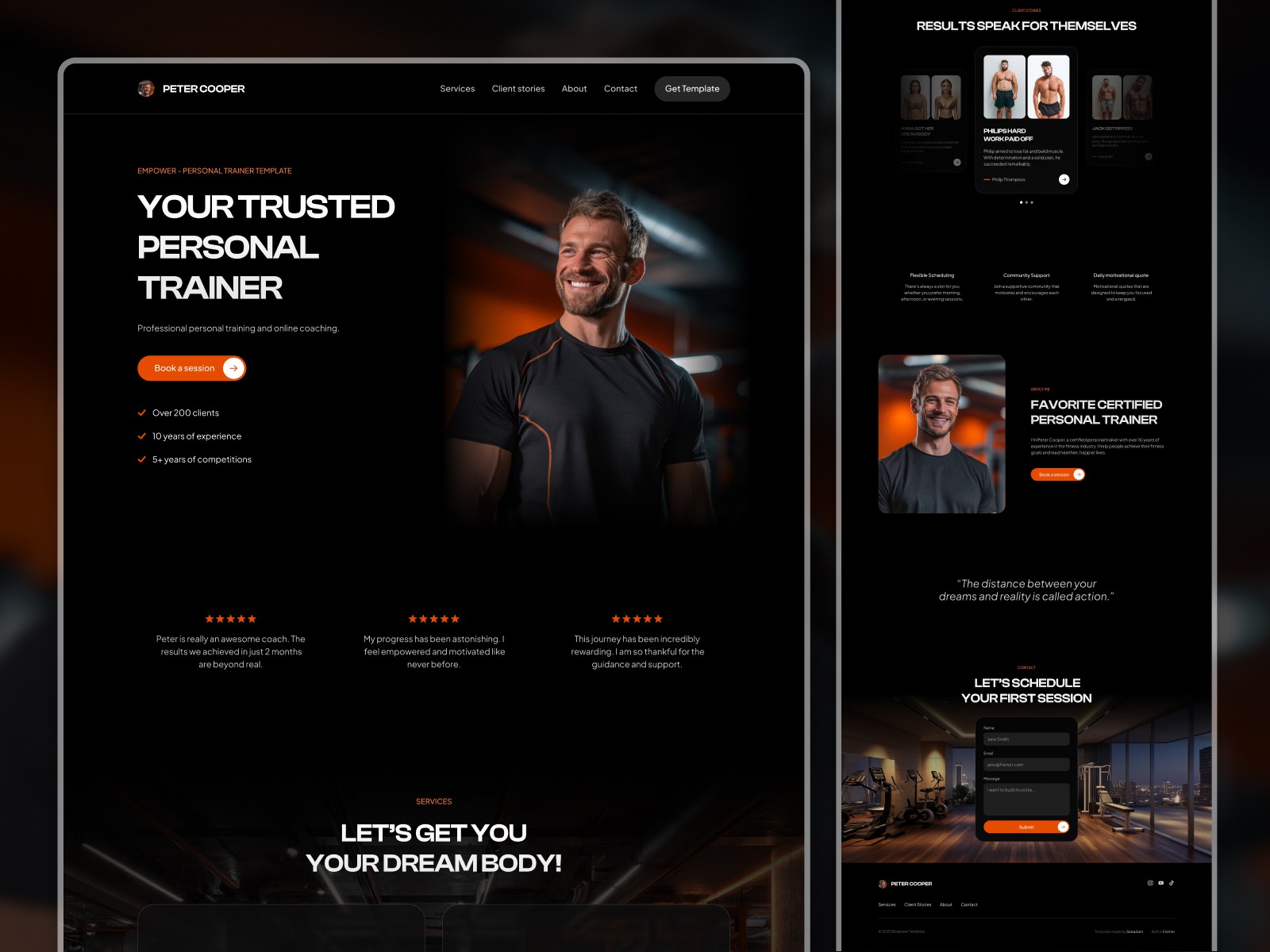
Hero section — Lead with the result you deliver, not your job title. "I help busy professionals build strength in 45-minute sessions" is stronger than "Online Personal Trainer." Include a clear CTA (book a call, fill out an inquiry form) and a strong photo.
Who you help — Be specific. "I work with women 35+ who want to build muscle without complicated programming" immediately tells the right person they're in the right place — and filters out the wrong ones.
Your approach — A short paragraph or a few bullets explaining your method. Not a certification list — a description of what working with you actually looks like.
Social proof — 3–5 client quotes, ideally with photos. If you have transformation photos, use one or two here and link to the full transformations page.
About you — Keep it relevant. Your training philosophy, your own fitness journey, what makes your approach different. People hire coaches they connect with, so let your personality come through.
CTA — End with a clear next step. "Book a free intro call" or "Fill out my coaching application" works well. Make it easy and specific.
How to showcase client transformations effectively
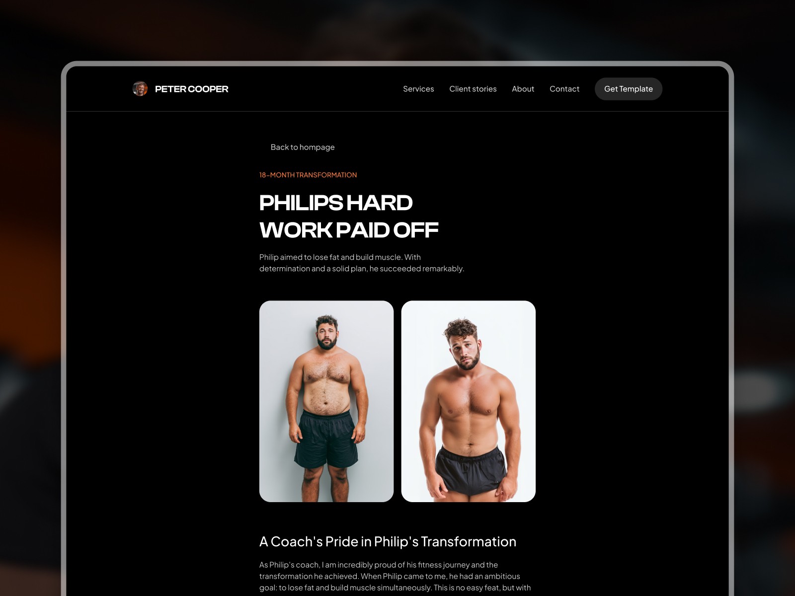
Before-and-after photos are the most powerful thing a personal trainer can put on their website. But most trainers either bury them in a blog post or dump them on Instagram and call it a day. A dedicated transformations page, done well, is a major conversion driver.
What makes a transformation gallery work:
Show the full story, not just the photo. A before-and-after image without context is forgettable. Add 2–3 sentences: who the client is, what they struggled with, and what changed. The story makes the photo believable.
Use a grid or gallery layout. Organized grids are easier to browse than a scrolling wall of images. Visitors scan — make it easy for them to land on a result that resonates with their situation.
Keep it updated. A gallery with 3 results from 2021 raises more questions than it answers. New results signal an active, in-demand coach. Aim to add a new transformation every 1–2 months.
Get client permission and use real names (or first names + initial). Anonymized results are fine, but named results with a short quote feel more credible.
A CMS-powered transformations page makes this significantly easier. Instead of editing your website every time you want to add a new result, you update a simple database — the page formats it automatically.
What makes good personal trainer website design
Personal trainer websites tend to fail in one of two ways: either they look like a corporate brochure (cold, generic) or they look like a cluttered fitness forum (overwhelming, unfocused). Good design avoids both.
Strong typography and whitespace. Fitness aesthetics tend toward bold fonts and dark backgrounds, which work well. What matters most is readability — body text at 16–18px, enough spacing between sections, headers that guide the eye naturally.
One dominant color + neutral. Pick one brand color (often a strong accent — orange, green, electric blue) and use it sparingly for CTAs and highlights. Keep the rest clean and neutral. This makes your action items stand out.
Photography over illustrations. Personal training is a personal service. Real photos of you, real photos of your clients (with permission), and action shots from your training environment build more trust than stock images or flat illustrations.
Mobile-first layout. Most of your visitors will arrive on a phone. Your hero section, your CTA button, and your contact form all need to work perfectly on a 375px screen before you worry about desktop.
Fast load time. Compress images before uploading, limit third-party scripts, and choose a fast hosting platform. Slow sites lose visitors before they've read a word. You can test your site speed with Google PageSpeed Insights — aim for a score above 80 on mobile.
For trainers who want a strong starting design without building from scratch, templates like Empower are built specifically for personal trainers and fitness coaches — with a clean layout, a CMS transformation gallery, and a contact form already in place.
How to get clients to actually contact you
A beautiful website that doesn't generate inquiries is just a portfolio. Your site needs to actively move visitors toward taking action.
One primary CTA, repeated. Don't give visitors ten options. Pick one action (book a call, fill out an application, send a message) and repeat it throughout the page — in the hero, after your about section, at the bottom. Clear > clever.
Lower the commitment. "Book a free 15-minute call" converts better than "Book a session" because it feels smaller. Give people a low-risk first step.
Contact form, not just email. An email address requires the visitor to open their mail app, write a subject line, compose a message. A short embedded form — name, email, one or two qualifying questions — is much easier. You'll get more inquiries.
Remove friction from the form. 3–5 fields is the sweet spot. Name, email, goal or situation, and maybe "how did you find me." More than that and you lose people halfway through.
Social proof near the CTA. Put a short testimonial or a transformation result directly above or below your contact form. This reassures hesitant visitors right at the decision point.
How to launch your site faster
Building a personal trainer website from scratch — designing layout, writing copy, setting up hosting — can take weeks if you're doing it yourself. Here's how to cut that time significantly:
Start with a Framer template. A good template gives you a professionally designed layout, with sections already structured for a service business. You swap in your photos, update the copy, and you're ready to launch. The heavy design work is done.
Write your copy before you touch the design. The biggest time sink is staring at placeholder text and not knowing what to write. Draft your homepage hero, your about section, and your service description in a Google Doc first. Then drop it into your template.
Use your real photos from day one. Stock photos are fine temporarily, but get real photos of yourself training as soon as possible. This single change makes more difference to trust and conversion than almost anything else on the site.
Don't wait for perfect. A published website with 3 pages beats a 10-page site that's been "almost ready" for four months. Launch with what you have, then improve.
CTA
If you're a personal trainer or fitness coach ready to launch a professional website, the Empower Framer template gives you a clean, conversion-focused design with a built-in CMS transformation gallery and contact form — everything you need to go from blank canvas to live site fast.
Frequently asked questions
Do I need a website if I already have a lot of followers on social media?
Yes — and those followers are exactly why. Anyone who sees your content and considers hiring you will look for a website. Without one, you lose credibility and make it harder for clients to take the next step. A website also lets you capture inquiries without relying on DMs or link-in-bio workarounds.
What should I charge for online personal training on my website?
Most personal trainers either list prices directly or use an application form that filters by budget. Listing prices reduces low-quality inquiries; hiding them and using a call first gives you more context before quoting. Try both and see what your audience responds to. Whichever you choose, be clear — vague pricing language loses trust.
How long does it take to build a personal trainer website?
Starting from a template, most trainers can get a functional 2–3 page site live within a few days — assuming the copy is written and photos are ready. Custom design from scratch takes significantly longer. The main bottleneck is almost always copy, not technical setup.
How do I get my personal trainer website to show up on Google?
Start with the basics: a clear page title that includes "personal trainer + [your city]" or your niche, a meta description, and a properly indexed site. Submit your URL to Google Search Console after launch. For local search, create a Google Business Profile. Content helps too — even one or two blog posts targeting questions your clients ask can build search visibility over time.


