Framer Components Explained — How to Edit & Reuse Elements
Components help you reuse elements, stay consistent, and update your website faster. In this tutorial, you’ll learn how components work and how to edit them efficiently in Framer.

10
min read


Components help you reuse elements, stay consistent, and update your website faster. In this tutorial, you’ll learn how components work and how to edit them efficiently in Framer.
What are components?
Components in Framer are used for elements that are repeated across your website, such as buttons, navigation bars, or footers. Instead of editing each instance manually, you can update the parent component, and the changes will automatically apply everywhere — as long as they are not overridden.
You can easily spot components by their purple border on the canvas.
Usually templates come with several predefined components for things like buttons, cards, and navigation elements.
Editing Component Instances
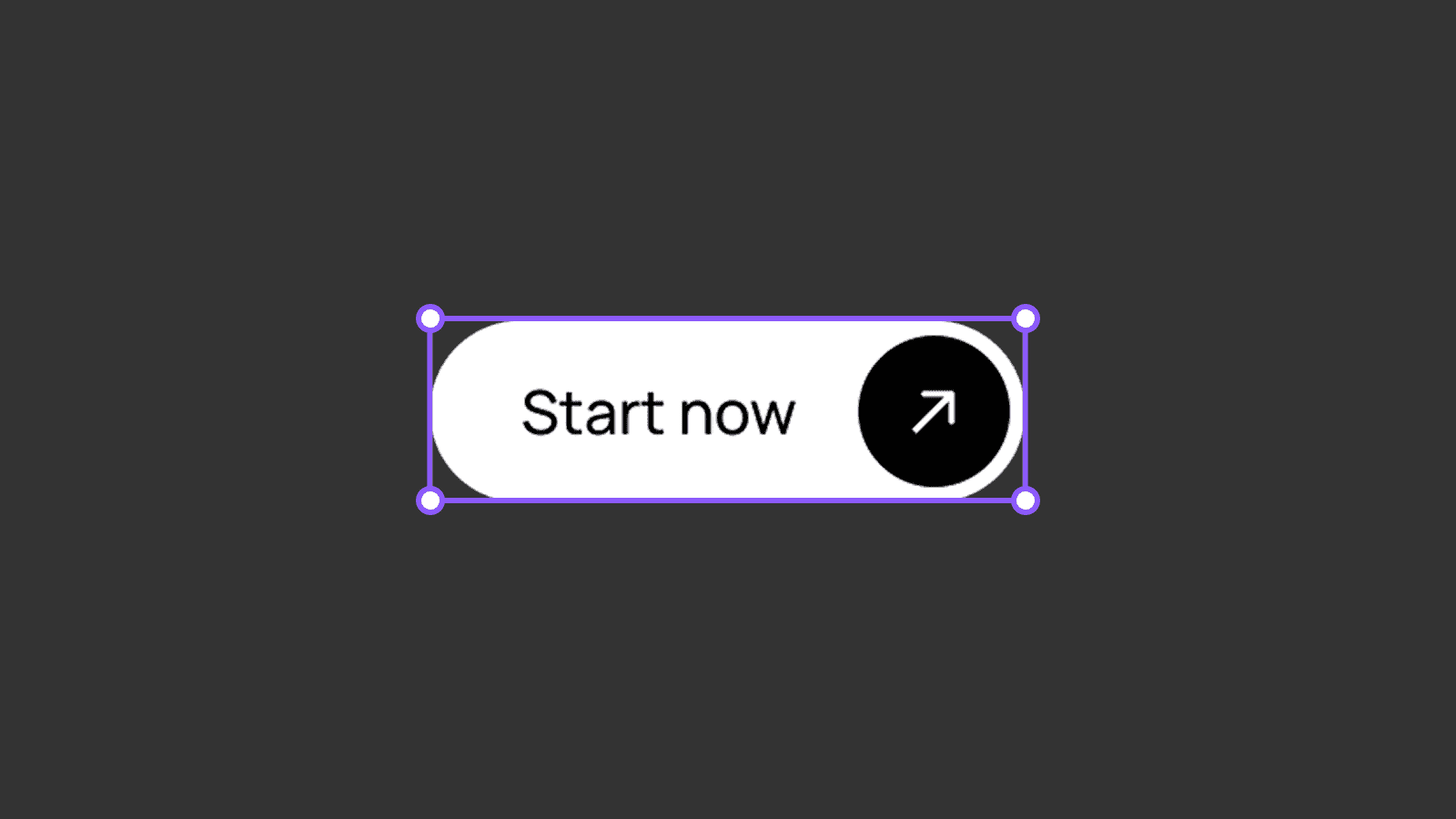
This is an example of a primary button component.
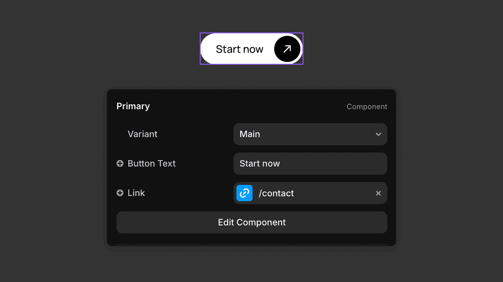
When you click on this component instance, you can change things like the button text or the destination link for that specific instance. These changes apply only to that instance and do not affect the parent component.
This is useful when you want the same button design across your website, but with different destination links.
Editing the Parent Component
If you want to change the component globally, you need to edit the parent component.
To do this, either
Double-click the component on the canvas
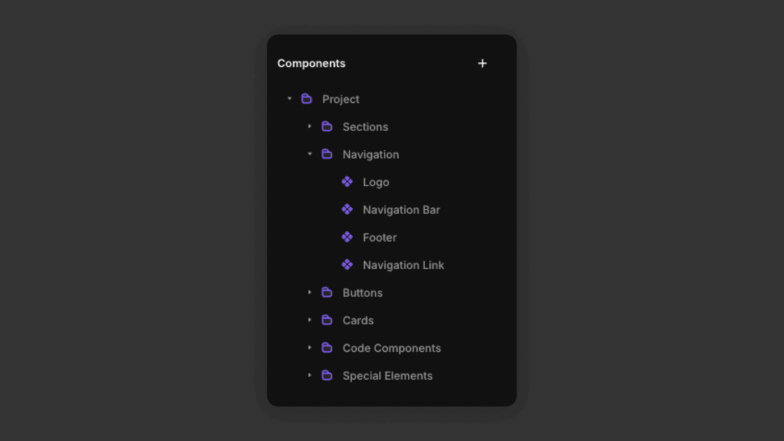
Find it in the Assets panel and open it from there
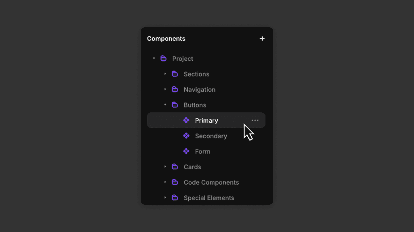
Any changes you make to the parent component will update all instances, unless a specific property has been overridden.
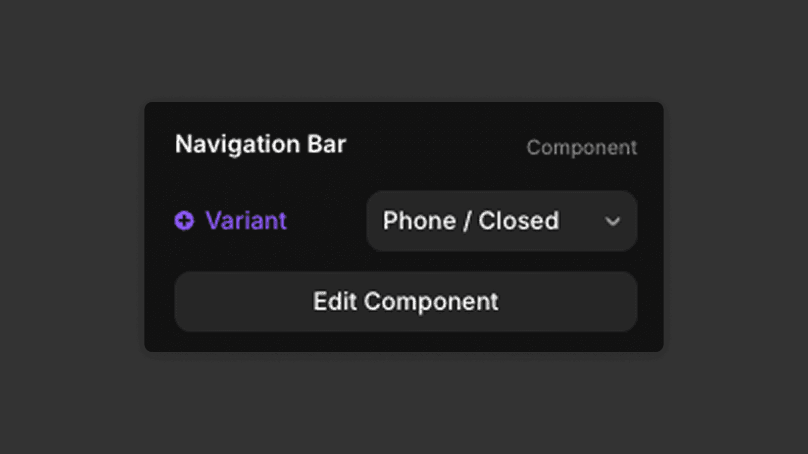
Component Variants
Components can have multiple variants.
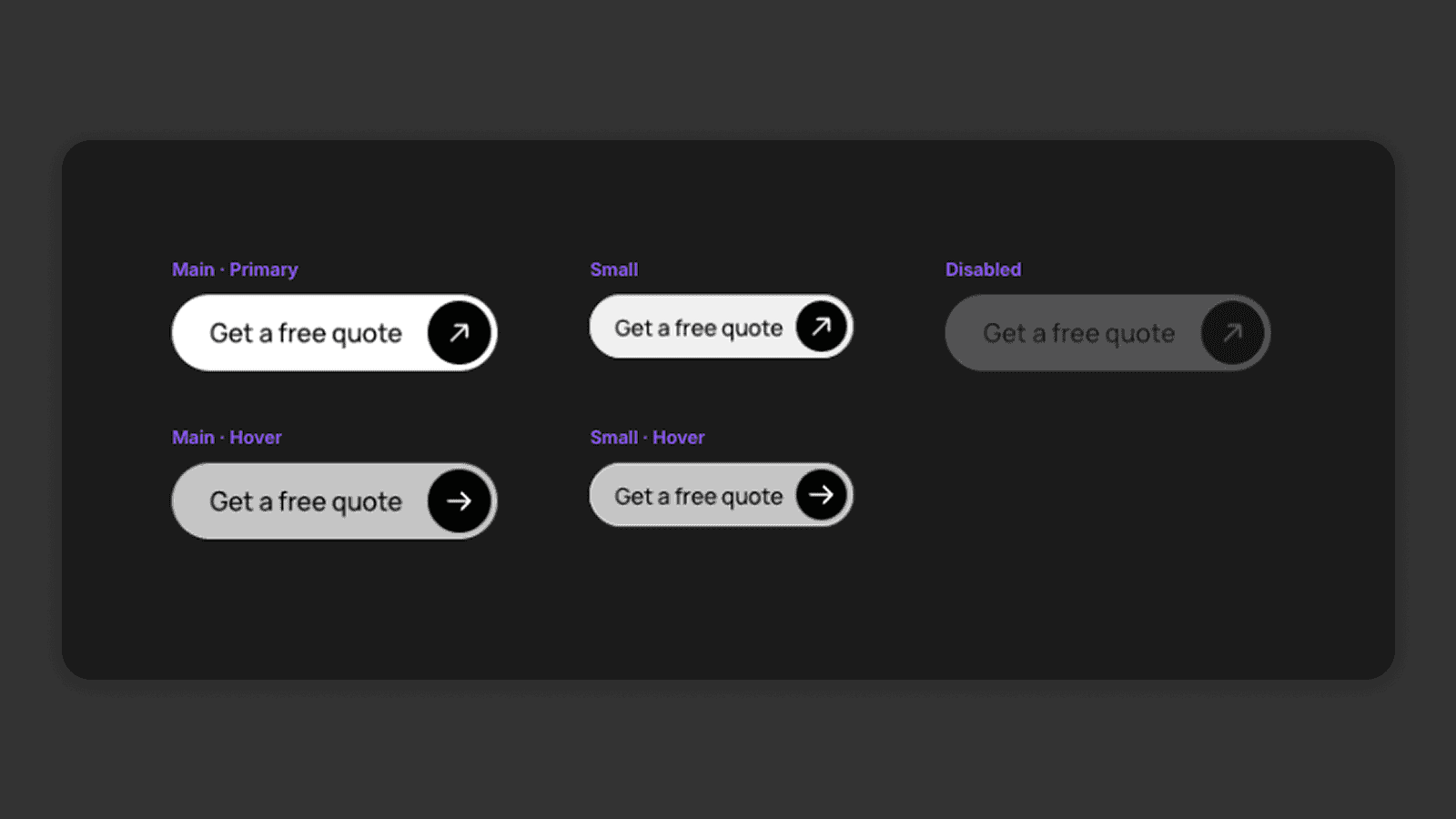
There is always one main variant. When you edit the main variant, those changes apply to all other variants.
Changes made to other variants only affect that specific variant.
On the canvas, you can choose which variant of a component you want to use. Variants are often used for things like
Button states
Different screen sizes
Open / closed menus
You can also create animations by transitioning between variants. You can learn more about animations in this tutorial from Framer.
Nesting Components
You can also nest components inside other components.
For example, a navigation bar component might contain:
A logo component
Navigation link components
A button component
This keeps your design modular and easier to manage.
Variants Across Breakpoints
Components and their variants can behave differently across breakpoints.
For example, a navigation bar might have:
A desktop variant
A tablet variant
A mobile variant
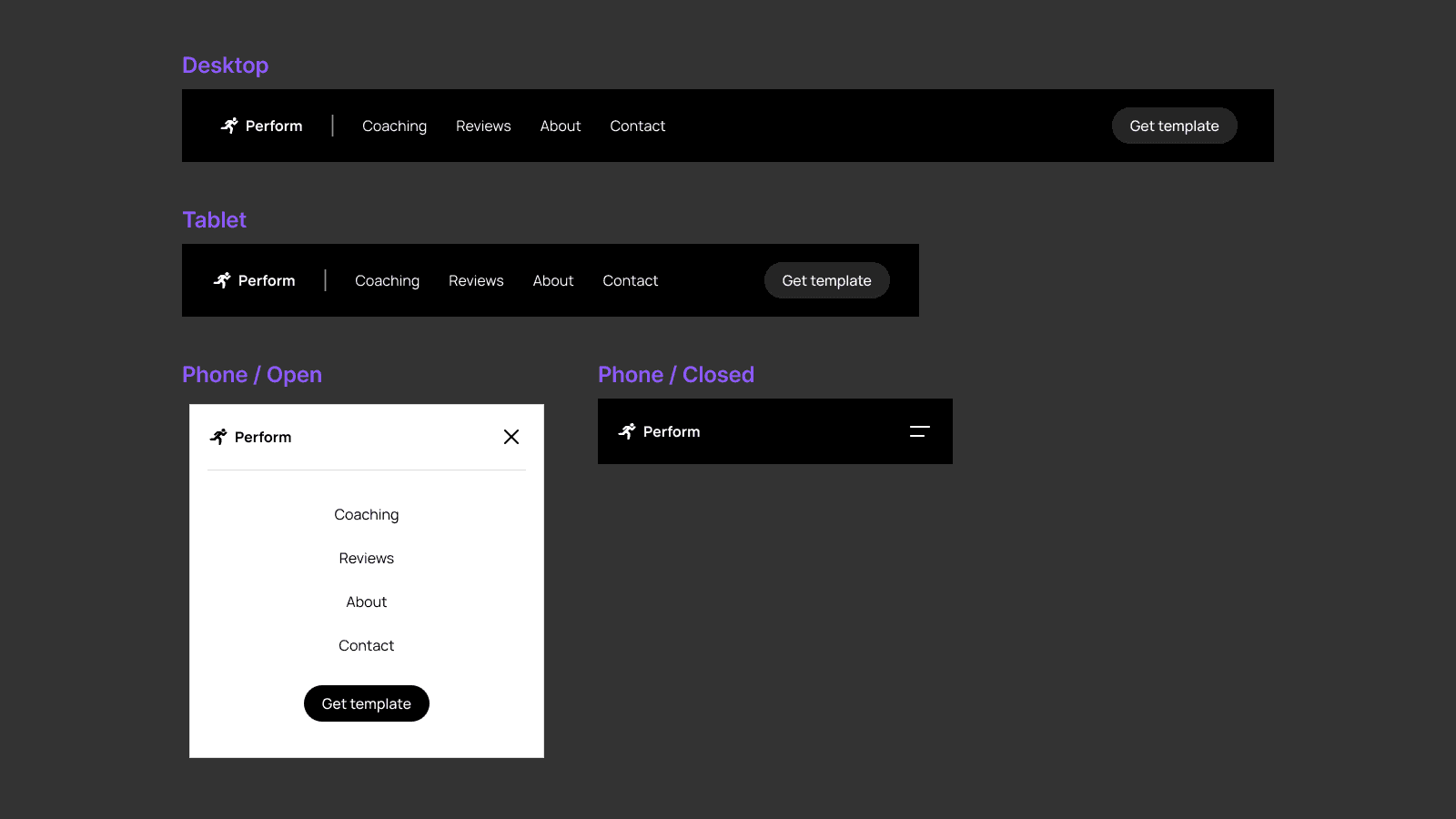
Each breakpoint can use a different variant to better fit the screen size. You just need to change the variant in the right panel for each of the breakpoints.
Now you know how components work, which makes working in Framer much faster and more efficient. In the next tutorial, we’ll take a look at layout templates.
Frequently asked questions
What are components in Framer?
Components are reusable design elements in Framer, identified by a purple border on the canvas. They are used for repeated elements like buttons, navigation bars, and cards. Editing the parent component updates all instances automatically. Learn how to edit component content in the editing content tutorial.
How do I edit a component in Framer?
Click a component instance to change its properties (like text or link) for that instance only. To edit the component globally, double-click it on the canvas or open it from the Assets panel — changes will apply everywhere.
What are component variants in Framer?
Variants are different visual states of a component — for example, a default button and a hover state, or a desktop and mobile navigation. You can select which variant to display on each breakpoint via the right panel. Global colors for variants are managed through design styles.
Can I nest components inside other components in Framer?
Yes. Framer supports nested components. For example, a navbar component can contain a logo component, navigation link components, and a button component — keeping your design modular and easier to manage globally.


