Framer Bubble Button — Arrow CTA with Hover Animation
What Is the Bubble Button?
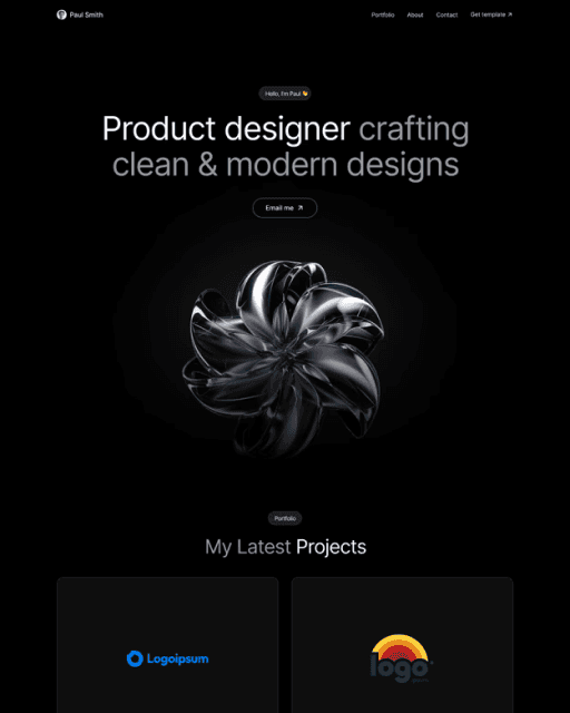
The Bubble Button is a Framer CTA component with a text label and a circular arrow icon beside it. On hover, both elements scale up together in a synchronized animation. Clean, direct — it signals action without being distracting.
Customize It
Text, colors, corner radius, padding, and link are all available as variables in the properties panel. To change the arrow direction, open the component and edit the icon layer manually.
Features
Circular arrow icon + label scale up together on hover
Synchronized animation — clean, purposeful motion
Customizable: text, colors, corner radius, padding, link
Adjustable animation speed via component internals
Free — no purchase or account required
Compatible with any Framer project or template
Frequently asked questions
How do I add Bubble Button to my Framer project?
Copy the component URL from this page, open your Framer project, click anywhere on the canvas, and paste it. Bubble Button appears instantly — no purchase needed.
What can I customize in Bubble Button?
Text, colors, corner radius, padding, and link are all available as variables in the properties panel. No code needed.
Can I use Bubble Button in multiple Framer projects?
Yes — once you have the component URL, you can paste Bubble Button into as many Framer projects as you like.
Can I use Bubble Button inside a template I bought from Sebadam.supply?
Yes — Bubble Button is compatible with any Framer project, including all templates from Sebadam.supply. Paste it onto your canvas and customize it to match the template's design.