Framer Breakpoints Explained — Make Your Site Responsive
In this tutorial, I’ll show you how breakpoints work in Framer and how you can use them to edit your template for different screen sizes. It’s one of the most important things to understand before you start customizing your website.

8
min read


In this tutorial, I’ll show you how breakpoints work in Framer and how you can use them to edit your template for different screen sizes. It’s one of the most important things to understand before you start customizing your website.
What are breakpoints?
Websites look different on each device size.
On desktop, you might have a wide layout with multiple columns, while on mobile, those same elements should stack vertically — because it’s better for smaller screens.
That’s exactly what breakpoints are for. They control how your design adapts at different screen widths. For example: desktop, tablet, and mobile.

Perform Framer Template Breakpoints
Why Breakpoints Matter
Breakpoints are key for making your website look great on every device.
They let you
Adjust layouts for different screen sizes
Change font sizes or spacing for better readability
Swap images or rearrange sections for mobile users
Remove hover-based interactions on mobile to make your site more accessible
This ensures your site is fully responsive and looks professional — from large desktop monitors to small phone screens.
How Breakpoints Work
When you start a new project your website is designed for desktop by default. With templates there are usually 2 to 3 breakpoints set up.
You can then create or edit breakpoints that automatically activate when the screen width is within a certain range.
The most common breakpoints are
1200 px: Desktop
810 px: Tablet
390 px: Mobile
So for example, if your website is opened in a window smaller than 810 px, Framer will automatically switch to the mobile view.
The desktop breakpoint acts as the parent. Any changes you make to it automatically apply to all smaller breakpoints — unless they are overridden.
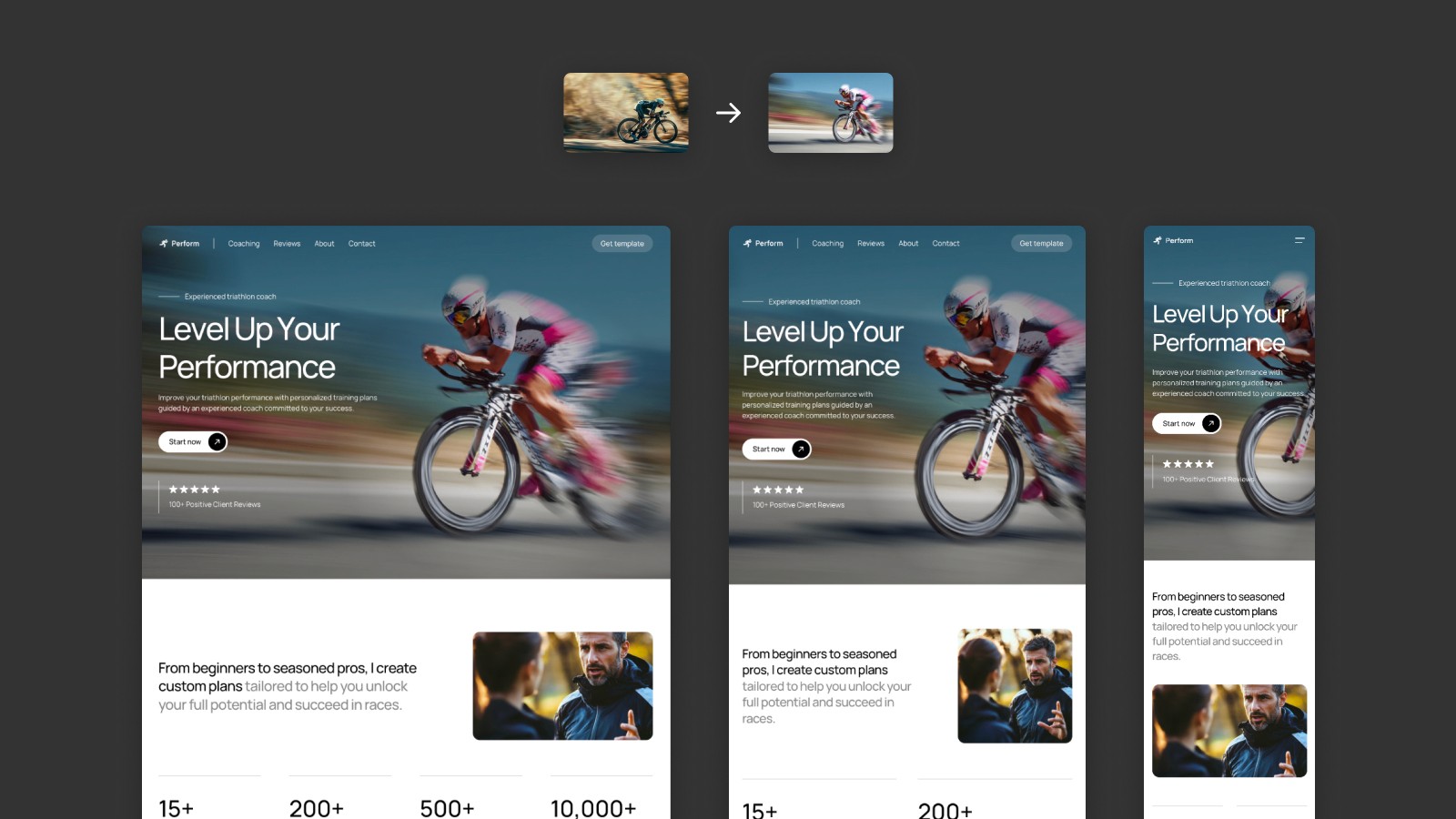
Making changes on the desktop breakpoint
Overriding Styles in Breakpoints
When you edit something on other breakpoint than desktop (like tablet or mobile), that change affects only that breakpoint. It overrides the style inherited from the desktop version.
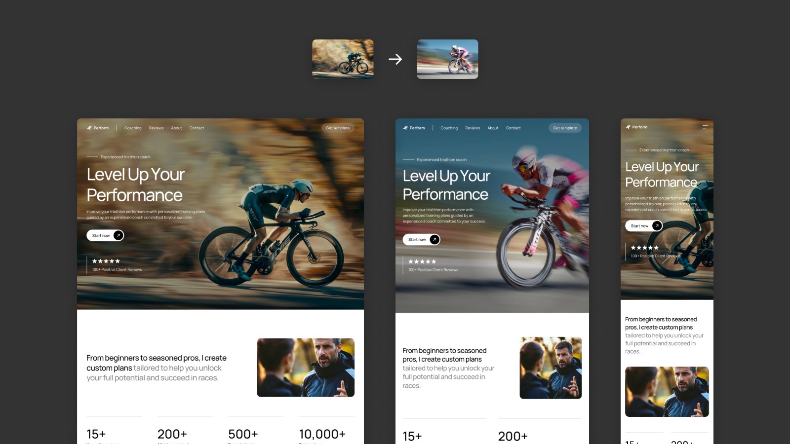
Making changes on the tablet breakpoint
For example, let’s say you replace an image only on the tablet breakpoint. Framer will keep the original image on desktop, but show the new one on tablet.
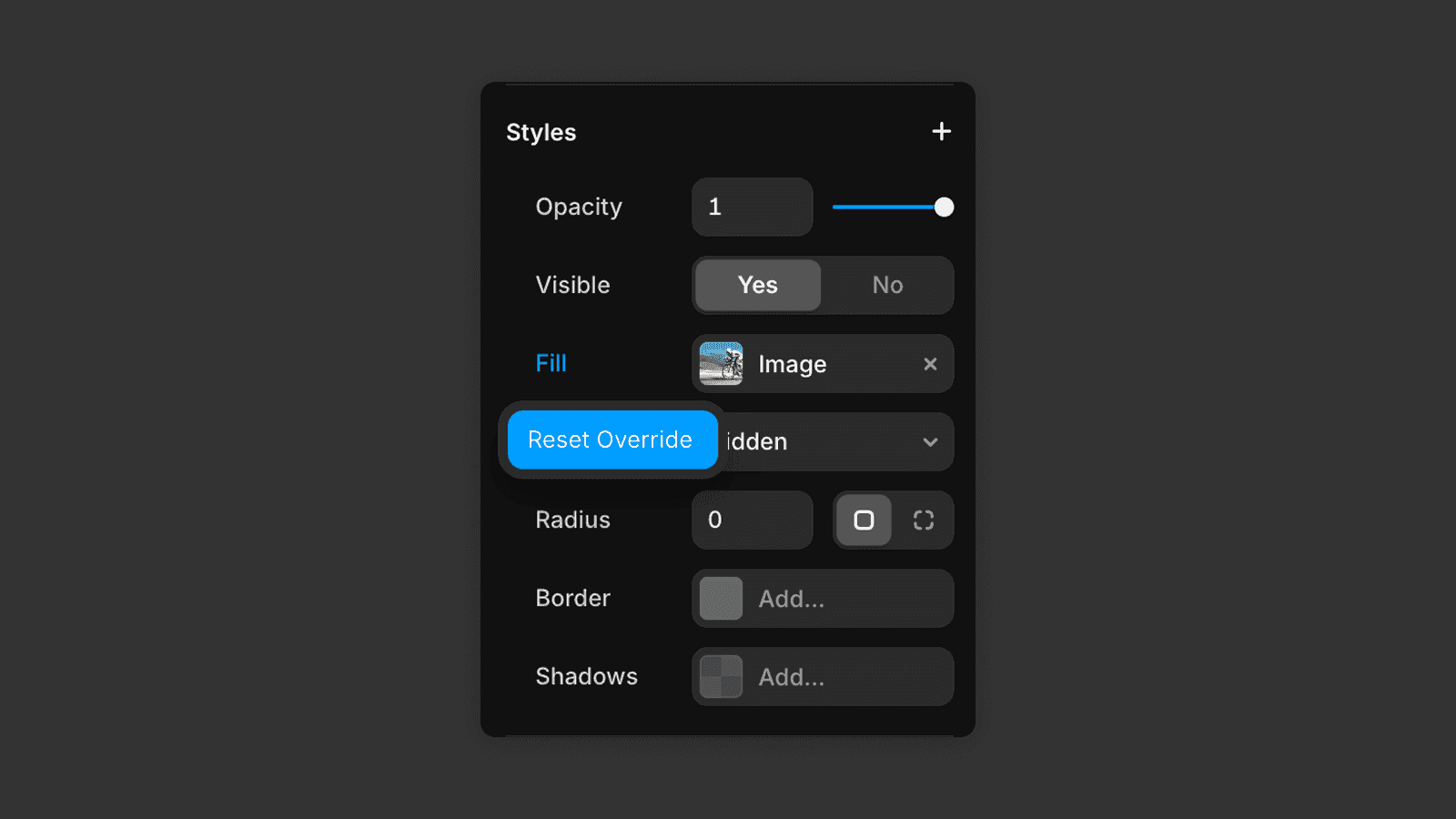
If you ever want to revert a change, click on the element and look at the right panel — overridden properties appear in blue.
Just click the blue value and select "Reset Override" to reset it and go back to the desktop style.
And that’s how breakpoints work in Framer.
Once you understand which changes apply globally and which ones stay within a specific breakpoint, editing your website becomes so easy and intuitive.
In the next tutorial, we’ll go over how to edit the content on your website.
Frequently asked questions
What are Framer breakpoints?
Framer breakpoints define at which screen widths your website layout changes. The three standard breakpoints are 1200px for desktop, 810px for tablet, and 390px for mobile. Framer automatically activates the right layout based on screen width. If you're new to Framer, the interface overview is a good starting point.
Do changes on desktop apply to all breakpoints in Framer?
Yes. The desktop breakpoint acts as the parent. Any change made on desktop automatically applies to smaller breakpoints — unless you manually override it on the tablet or mobile breakpoint.
How do I override a style on mobile in Framer?
Switch to the mobile breakpoint, select the element, and change the property. Overridden properties appear in blue in the right panel. To revert the change, click the blue value and select "Reset Override."
Can I create custom breakpoints in Framer?
Yes. In Framer you can add custom breakpoints beyond the default three by setting a specific pixel width. Framer will activate that layout when the browser window falls within the defined range.


