How to Create a Monochromatic Color Palette for Your Website

Adam Sebesta
September 22, 2002
5
min read
How to Create a Monochromatic Color Palette for Your Website
Do you love the clean, modern look of monochromatic websites? A monochromatic color palette can give your site a unique aesthetic that makes your brand stand out and leaves a lasting impression on visitors. But how do you create a monochromatic palette that looks polished and professional?
Good news! It’s easier than you may think. In this guide, we’ll walk you through the steps to create a stunning monochromatic color scheme for your website.
What is a Monochromatic Color Scheme?
A monochromatic color scheme is one where all the colors come from a single base hue. The palette is created by adjusting the lightness, saturation, and brightness of that hue to create lighter and darker shades.
For example, if you select blue as your base color, your palette might include very light blues, medium blues, and very dark blues. This creates a cohesive look that is pleasing to the eye and provides enough variation to make the design dynamic.
Why Use a Monochromatic Color Palette in Website Design?
A monochromatic palette simplifies the design process while still providing visual interest. Since you’re working with variations of the same hue, the design looks unified and professional without feeling overwhelming.
Here are some benefits of using a monochromatic color scheme in web design:
Consistency: Using shades of one color creates a harmonious look. This makes it easier for users to navigate your site and focus on the content rather than the design itself.
Minimalistic Appeal: Monochromatic designs often have a clean, modern look that’s perfect for minimalistic websites. If you’re aiming for a sleek, professional feel, a monochromatic palette is an excellent choice.
Brand Recognition: A consistent color scheme helps reinforce brand identity. Visitors will remember your brand through the consistent use of a specific color.
Easy to Adjust: If you decide to change your website’s overall look in the future, modifying a monochromatic palette is easy. You can swap the base color and adjust the shades without a complete redesign.
Examples of Great Monochromatic Websites
Here are some examples of websites that use monochromatic color palettes effectively:
Proton.me (Violet): Proton.me uses a purple-violet color scheme that reflects security and trust, aligning with their focus on privacy-first services.
Mailerlite.com (Green): MailerLite features a fresh green palette, which conveys simplicity and growth, aligning with their user-friendly email marketing platform.
Buffer (Blue): Buffer uses calming blue tones throughout its website, creating a professional and trustworthy atmosphere for its social media management tools.
Step 1: Choose Your Main Color
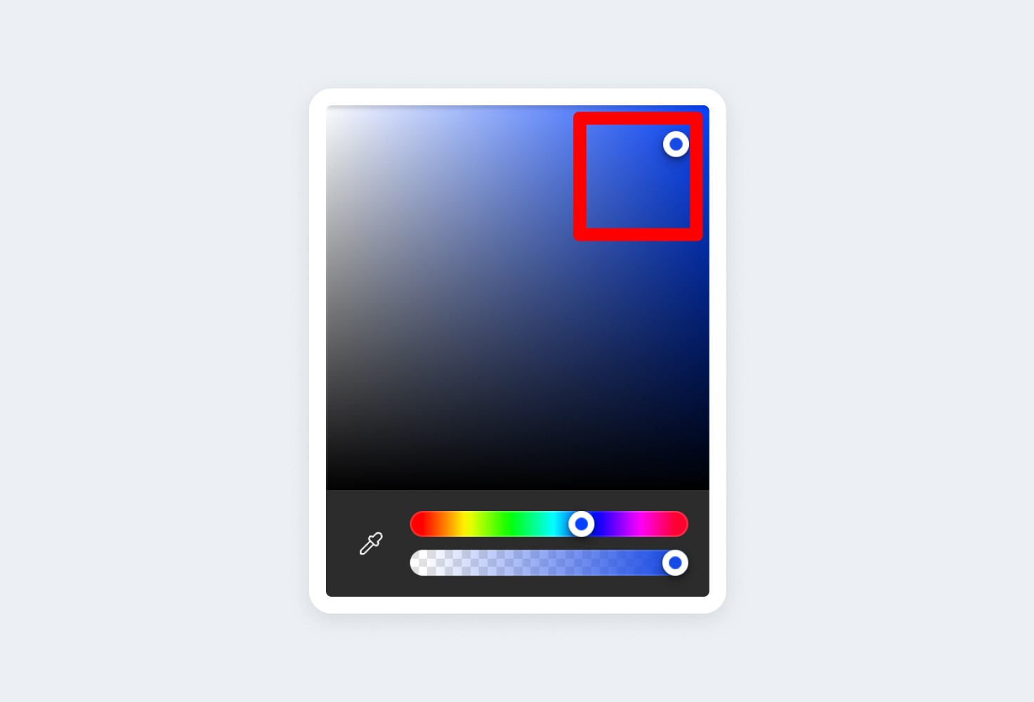
The first step in creating a monochromatic color palette is to choose your base color. This could be blue, green, or any other color that fits your brand identity. The main color should be vibrant, with strong saturation and brightness, as it will serve as the foundation of your palette.
To start, open a color picker in your preferred design tool (make sure it’s set to RGB mode). From there, select the hue you like and pick a shade from the top right corner of the picker.
For this example, we’ll be using blue as the base color.

Step 2: Create Light Shades
Next, you’ll want to create the lighter shades of your base color. These lighter tones will add variety and balance to your design.
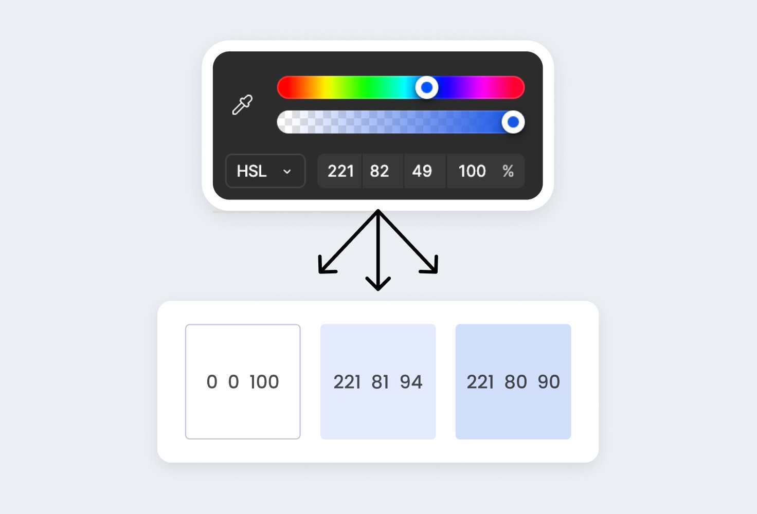
Switch your color mode to HSL (Hue, Saturation, Lightness). Increase the lightness while slightly lowering the saturation to create a range of lighter shades. Feel free to adjust based on how it looks for your specific color.
For our blue palette, we’ll create three lighter shades: one white, one very light blue, and one medium-light blue.

Step 3: Create Dark Shades
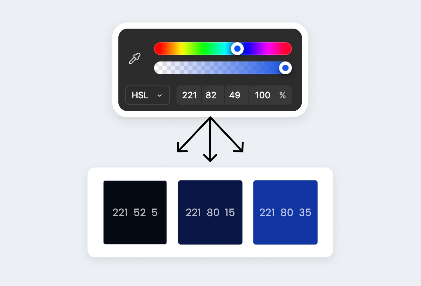
Now, it’s time to create the darker shades of your color. The process is similar to creating light shades, but instead of increasing lightness, you’ll decrease it.
For this blue monochromatic palette, we’ll create three darker shades: one almost black, one very dark blue, and one darker version of the base blue.

Step 4: Apply the Colors to Your Design
Now that you have your monochromatic color palette, here are some tips on how to use it effectively in your website design:
Use Darker Shades for Text: The darkest shade in your palette is ideal for text. It provides good contrast against lighter backgrounds, making your content easy to read.
Highlight Key Elements with the Primary Color: Use the main color (the base hue) for important elements like buttons, calls to action, or links. This draws the user’s attention to what’s most important.
Utilize Lighter Shades for Backgrounds: Lighter shades work well as backgrounds for sections of your website. They add depth without distracting from the content.
Accent with Intermediate Shades: The medium shades in your palette can be used for borders, icons, or other small accents. This brings variety to the design without clashing with the overall look.

Final Thoughts
Creating a monochromatic color palette for your website doesn’t have to be complicated. By following these simple steps, you can create a visually appealing and professional-looking design that strengthens your brand identity.
If you’ve created a palette but aren’t sure how to build your website, check out our website templates. They’re easy to customize - just swap in your colors and text, and your website will be ready to go live!

About the author
Adam Sebesta
Adam is a professional web designer with over three years of experience creating modern websites for service-based businesses. Now, he focuses on creating seamless Framer templates to help businesses launch new websites efficiently, saving money without compromising on quality.


